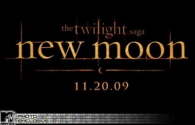
New Moon loggan
Första titten på New Moon loggan. Vad tycker ni??

"As for the logo itself, Weitz has chosen to stay with the lowercase lettering, personable font and light-streaks-poking-through look of last year's hit film. In switching from blue to orange, the movie's upcoming posters will be instantly distinguishable from those of the original "Twilight" - which should make them look a whole lot cooler when teenage girls all over the world add them to their walls. The presence of orange also begs a new question: Now that blue and orange are taken, which colors should be used for "Eclipse" and "Breaking Dawn?"
Kommentarer
Trackback

